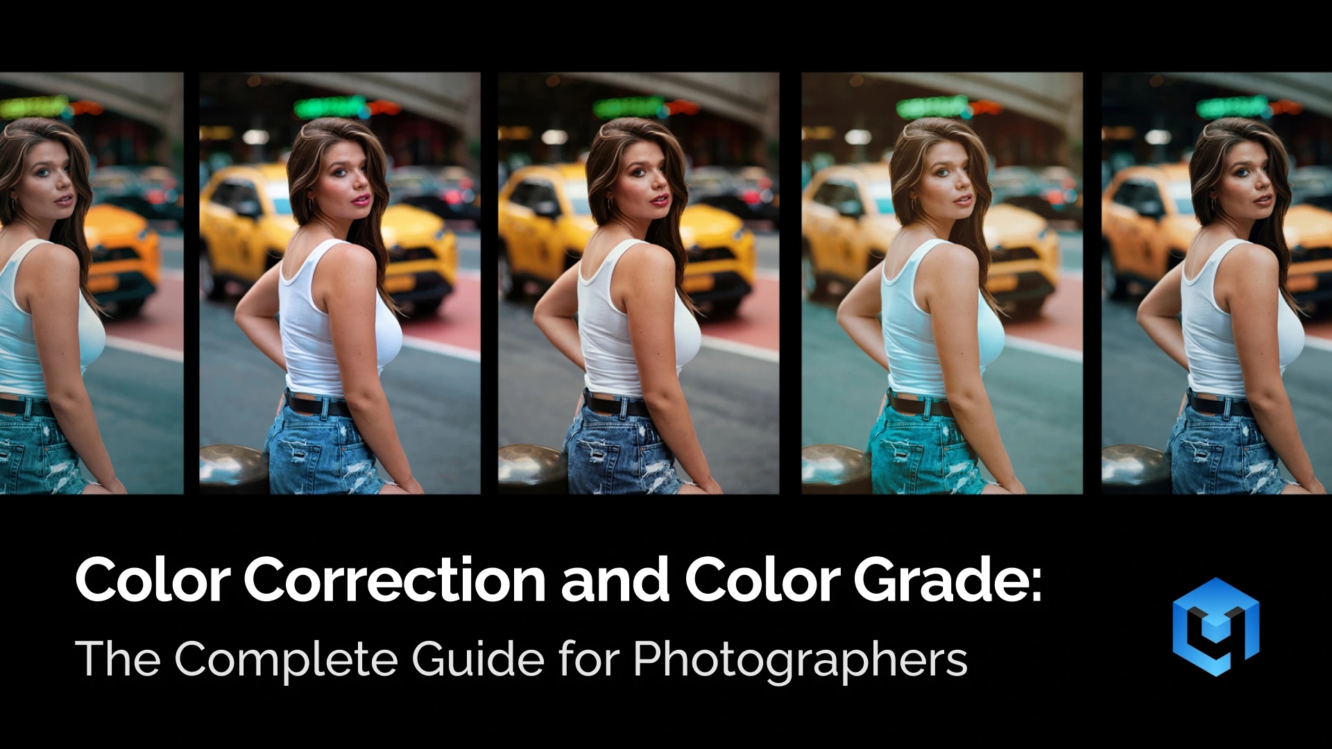
Color plays a key role in how a photo is perceived. It affects mood, clarity, and visual impact. Whether shooting portraits, weddings, or products, understanding color is essential for consistent and professional results.
Photographers today work in fast-paced environments, from studio setups to outdoor locations across cities like Amsterdam, Tokyo, or New York. Lighting conditions change constantly, and cameras do not always capture colors accurately. This makes color correction and grading a necessary part of every workflow.
This guide explains the full process in a simple and practical way. It covers the difference between color correction and colour grading, shows a step-by-step workflow, and explains how to apply these techniques across different photography genres.
You will also learn how modern tools, including AI-based solutions like color matching, can speed up editing and improve consistency across large photo sets.
By the end of this guide, you will understand how to correct color accurately, apply grading with intention, and build a clean and reliable editing workflow.
What Is Color Correction?
Color correction is the technical post-production process of adjusting colors in a photo to make them look natural and accurate. It focuses on fixing technical issues that appear during shooting. These issues often come from lighting conditions, camera settings, or mixed light sources. The goal is simple: the image should reflect reality as closely as possible.
In photography, color rarely looks perfect straight out of the camera. Indoor lighting can create strong yellow or orange tones. Shade often adds a cold blue cast. Even professional cameras can misinterpret white balance and exposure. Color correction removes these shifts and restores visual balance.
White Balance
This process usually starts with white balance adjustment. It neutralizes color casts and makes whites appear truly white. Once the color temperature looks correct, exposure and brightness are adjusted. The image should feel evenly lit, without losing important details in shadows or highlights.
Contrast
Contrast is another important part of correction. A flat image lacks depth and looks dull. By adjusting contrast, photographers separate light and dark areas more clearly. This helps define shapes, textures, and overall structure within the frame.
Color Consistency
A well-corrected image also improves color consistency. Skin tones become more natural and believable. Product colors match real-life expectations. Landscapes regain realistic tones without looking overly saturated or artificial. This is especially important for professional work, where accuracy builds trust.
For example, a portrait taken under warm indoor lighting may look too orange. After correction, skin tones appear neutral and lifelike. In another case, an underexposed photo may hide details in shadows. Proper adjustment reveals those details without overexposing the image.
It is important to understand that color correction is not about style. It does not aim to create a specific mood or artistic effect. Instead, it prepares the image for further editing steps. A clean, balanced photo gives more control during retouching and color grading.
In a typical workflow, color correction always comes first. It creates a reliable foundation for every next step. Without it, even the best creative edits can look inconsistent or unnatural.
What Is Color Grading?
Color grading is the artistic post-product process of creatively adjusting colors in a photo to achieve a specific mood or style. Unlike color correction, it is not about accuracy. It is about visual storytelling and artistic direction. The goal is to shape how the image feels, not just how it looks.
After a photo is technically balanced, the editing process usually continues with retouching. This step focuses on cleaning up details and refining the image. Once retouching is complete, color grading begins.
At this stage, the photographer makes intentional color choices. These choices can enhance emotion, guide attention, or create a recognizable visual identity. Even small color shifts can completely change the perception of an image.
Colour grading often involves changing the relationship between colors. Highlights and shadows can be tinted differently. Certain hues can be emphasized, while others are reduced. The image becomes more stylized and expressive, depending on the desired result.
Many grading styles come from cinema. One of the most popular looks is teal and orange. In this style, shadows shift toward teal, while skin tones stay warm. This creates strong contrast and makes subjects stand out clearly. Another example is the soft pastel palette often associated with Wes Anderson movies. These images feel controlled, balanced, and slightly surreal.
Some styles reduce color instead of enhancing it. Desaturated looks are common in war photography and documentary-inspired work. Colors become muted to create a serious or dramatic tone. In contrast, bright and airy styles use soft contrast and lifted highlights. This approach is popular in lifestyle and wedding photography.
In photography, color grading helps define a personal style. Two photographers can color grade the same image differently. One may choose warm tones and soft contrast. Another may prefer cooler tones and deeper shadows. Both results can be technically correct, but visually unique.
It is important to remember that grading builds on correction. Without a clean base image, color grading becomes unpredictable. Skin tones may break, and colors can look unnatural. A properly corrected photo gives full control over creative adjustments.
Color grading is where technical editing becomes creative expression. It allows photographers to go beyond reality and shape the final visual experience.
Color Correction vs Color Grading: Key Differences
Color correction and color grading are closely related processes, but they serve different roles in photography. Both involve adjusting colors, yet their purpose, timing, and approach are not the same. Understanding this difference helps photographers build a clean and predictable editing workflow.
| Color Correction | Color Grading | |
| Purpose | Technical accuracy | Creative process |
| Goal | Fix color and exposure issues | Create mood and visual style |
| Focus | Accuracy and realism | Emotion and storytelling |
| Role in workflow | First step | Second step, after correction |
| White balance | Neutralizes color casts | May shift colors intentionally |
| Exposure | Balanced and natural | Can be adjusted for artistic effect |
| Contrast | Restores natural depth | Stylized contrast for mood |
| Skin tones | Must look natural and correct | Can be slightly stylized |
| Consistency | Ensures uniform results across images | Ensures consistent style |
| Tools used | White balance, exposure, curves, basic sliders | HSL, color wheels, split toning, LUTs |
| Result | Clean, neutral image | Stylized, expressive image |
Another important difference is workflow order. Color correction always comes first. It builds a clean and reliable foundation for further edits. Without this step, grading becomes unpredictable. Colors may shift unevenly, and skin tones can break easily.
The mindset also shifts between these stages. During correction, the photographer evaluates what is technically wrong. During colour grading, the focus moves to what feels visually right. Both steps are essential, but they require different ways of thinking.
In practice, skipping color correction often leads to poor results. Even strong grading cannot fix underlying technical issues. On the other hand, stopping at correction can leave images looking flat or unfinished.
A complete workflow always includes both steps. First, color correct the image to achieve natural and accurate color. Then apply grading to shape mood and style. This sequence ensures both precision and creative control.
How to Color Correct Step-by-Step
Color correction follows a clear and logical sequence. Each step builds on the previous one. Skipping steps often leads to unstable or inconsistent results. A structured workflow helps achieve clean and predictable edits.
- White Balance Correction
White balance defines how warm or cool the image looks. It is the most common source of color problems. Different light sources create different color casts. Indoor light often adds yellow or orange tones. Shade and cloudy weather can create a blue tint.
The goal is to neutralize these shifts. Look for objects that should be white or gray. These areas help judge color accuracy. Adjust the temperature slider to control warmth. Use the tint slider to remove green or magenta shifts.
For example, use these adjustments:
- If the image looks too yellow or orange → reduce temperature
- If the image looks too blue → increase temperature
- If colors look slightly green → add magenta tint
- If colors look slightly purple → add green tint
Skin tones are the best real-world reference. They should look natural and balanced.
- If skin looks too orange → cool the image slightly
- If skin looks pale or blue → warm it up
Most editing software offers an eyedropper tool. It can automatically set white balance using a neutral point. This is a good starting point, but manual refinement is often needed.
Avoid chasing “perfect” white balance. A slight warm or cool tone can still look natural. The goal is balance, not perfection.
Once the color temperature looks natural, move to brightness and exposure.
- Exposure and Brightness Adjustment
Exposure controls how light or dark the image appears. It directly affects visibility and detail. Incorrect exposure can hide important elements in the frame.
Start by evaluating the overall brightness.
- If the image feels too dark → increase exposure
- If it feels too bright → decrease exposure
- If the subject is hard to see → adjust exposure first
Then refine the result with additional controls:
- If bright areas lose detail → reduce highlights or whites
- If dark areas hide detail → raise shadows
- If the image looks flat → adjust contrast later, not exposure
Focus on the main subject first. Faces, products, or key elements should be easy to see. Background areas can be slightly darker or lighter.
Most editing tools offer additional controls:
- Exposure slider – adjusts overall brightness
- Whites and blacks – control extreme light and dark points
- Highlights and shadows – refine specific tonal areas
A common mistake is over-brightening the image. This reduces contrast and makes the photo look flat. The goal is balanced light, not maximum brightness.
After setting brightness, the image may still look flat. This is where contrast helps.
- Contrast and Tone Curve
Contrast adds depth and structure to the image. It separates light and dark areas and makes details more visible. Without contrast, photos often look dull and lifeless.
Start with the basic contrast slider:
- If the image looks flat → increase contrast slightly
- If the image looks harsh → reduce contrast
- If details disappear in shadows → lower contrast or adjust shadows
For more control, use the tone curve:
- If shadows feel too light → lower the curve in shadows
- If highlights feel weak → raise the curve in highlights
- If the image lacks depth → apply a gentle S-curve
The tone curve can also fix flat lighting conditions. It helps restore depth without overprocessing the image.
Be careful with strong contrast. Too much can crush shadows and remove detail. Always check important areas after adjustment.
Once contrast looks balanced, refine specific tonal areas.
- Highlights, Shadows, and Midtones
This step refines the tonal balance of the image. It helps recover detail and improve clarity. Apply these targeted adjustments:
- If the sky or bright areas look blown out → reduce highlights
- If the image feels too dark overall → raise shadows slightly
- If the subject is not clear → adjust midtones
Additional practical rules:
- If shadows look too heavy → lift shadows carefully
- If highlights look dull → increase highlights slightly
- If the image looks washed out → reduce shadows and increase contrast
Shadows affect the darkest areas. Increasing shadows can reveal hidden details. This is useful in backlit scenes or dark environments.
Midtones control the overall visibility of the subject. They are especially important for portraits. Adjust midtones to keep faces clear and natural.
Most editing tools include:
- Highlights – controls bright areas
- Shadows – controls dark areas
- Midtones – adjusts overall balance
Avoid extreme adjustments. Lifting shadows too much can introduce noise. Reducing highlights too much can make the image look flat.
Once tonal balance is color correct, move to color intensity.
- Saturation and Vibrance
Color intensity plays a major role in how a photo feels. It can make an image look vivid and energetic, or soft and natural. Even small changes can affect mood and attention.
Saturation controls the strength of all colors. Increasing it makes colors more intense. Decreasing it creates a softer look.
Vibrance works more selectively. It enhances weaker colors while protecting strong tones and skin. This makes it a safer starting point.
Use these guidelines:
- If the image looks dull → increase vibrance slightly
- If colors look too strong → reduce saturation
- If skin tones look unnatural → lower saturation
Do the vibrance:
- If some colors are weak → increase vibrance
- If strong colors already look intense → avoid adding more
Then adjust saturation if needed. Make small changes and stop early.
A common mistake is over-saturation. Colors can quickly look artificial and distracting, especially in skin tones.
Most editing tools provide:
- Saturation slider – global color intensity
- Vibrance slider – selective color enhancement
- HSL panel – control individual colors
- Tone curve – subtle color and contrast adjustments
The key is moderation. If the viewer notices the editing first, the adjustment is too strong.
- Using Scopes: Histogram, Waveform, Vectorscope
Scopes help evaluate an image objectively. They show technical information that the eye can miss. This is especially useful when your screen brightness is not reliable.
The most important rule is simple. Do not rely only on how the image looks. Use scopes to confirm your adjustments.
Histogram
The histogram is the easiest scope to understand. It shows how brightness is distributed across the image.
- The left side represents shadows.
- The middle shows midtones.
- The right side represents highlights.
A well-balanced image usually has information across the entire range. It should not be pushed too far to one side.
- If the graph is pushed to the left → increase exposure
- If the graph is pushed to the right → decrease exposure
- If both ends are empty → image may lack contrast
- If data hits the edges → detail is being lost
Pay attention to clipping. This happens when data touches the edges. Clipped shadows lose detail completely. Clipped highlights become pure white.
A good histogram usually looks like a smooth curve across the range. It should not be stacked heavily on one side. It should not be cut off at the edges.
Simple reference:
- Balanced image – spread across left to right
- Low contrast – graph looks narrow and centered
- High contrast – graph stretches across full range
- Problem image – graph clipped or heavily shifted
A good approach is to keep the histogram slightly away from both edges. This helps preserve detail in all areas.
Waveform
The waveform shows brightness across the image from left to right. It is more detailed than the histogram.
Each point in the waveform corresponds to a position in the frame. The bottom represents shadows. The top represents highlights.
This tool helps detect uneven exposure. The histogram cannot show this difference, but the waveform can. This is how to use it in practice:
- If one side of the waveform is higher → that side is brighter
- If the subject area is too low → increase exposure or midtones
- If highlights spike too high → reduce highlights
- If shadows are flat at the bottom → you are losing detail
Waveform is especially useful for portraits. Skin tones should usually sit in the midtone range. They should not be too close to shadows or highlights.
- If skin tones sit too low → face looks too dark
- If skin tones sit too high → face may look overexposed
Waveform values usually range from bottom (0) to top (100).
Use this as a guide:
- Shadows → near the bottom, but not fully flat
- Midtones → around the middle
- Highlights → near the top, but not clipped
For portraits:
- Skin tones usually sit in the midtone range
- If skin is too low → image looks underexposed
- If skin is too high → image may look washed out
It also helps when adjusting backgrounds. You can see if a background is too bright compared to the subject.
Vectorscope
The vectorscope shows color information instead of brightness. It displays hue and saturation.
The center represents no color. The further the signal moves outward, the more saturated the colors become. Use it as a guide for decisions:
- If the signal is too far from center → reduce saturation
- If colors feel weak → slightly increase saturation or vibrance
- If skin tones drift away from the skin tone line → adjust tint or HSL
Different directions represent different colors. For example, red, blue, green, and skin tone ranges.
One of the most useful features is the skin tone line. It helps keep skin colors natural. If the signal drifts too far from this line, skin may look unnatural.
For example:
- Skin too green → add magenta
- Skin too purple → add green
- Skin too orange → slightly cool the image
Vectorscope also helps control saturation. If the signal spreads too far outward, colors may be too strong.
How Beginners Should Use Scopes
Beginners do not need to use all scopes at once. Start with the histogram. It gives enough information for basic correction.
Over time, these tools become easier to read. They help make editing more precise and consistent.
If something feels off, ask:
- Does the image look too dark or bright? → check histogram
- Does lighting feel uneven? → check waveform
- Do colors feel unnatural? → check vectorscope
The goal is not perfect graphs. The goal is a natural and balanced image.
Final Check Before Moving Forward
Before moving to the next step, review the image carefully.
Check the following:
- Colors look natural, not tinted
- Skin tones look believable
- No clipped highlights or crushed shadows
- The subject is clearly visible
If something feels wrong:
- Strange colors → check white balance
- Too dark or bright → adjust exposure
- Flat image → adjust contrast
- Unnatural colors → reduce saturation
Make small corrections instead of large changes. Subtle edits usually look more professional.
This corrected image becomes the foundation for colour grading. A strong base makes all further edits easier and more predictable.
Color Grade Techniques for Photos
Color grading is where technical editing turns into creative expression. After correction, the image is clean and balanced. Now the photographer can shape mood, atmosphere, and visual style.
The key idea is simple. Color grading is not about fixing problems. It is about making intentional choices.
Split Toning (Highlights and Shadows)
Split toning is one of the simplest ways to stylize an image. It applies different colors to highlights and shadows. This creates separation and adds depth. It can be imagined as a color contrast inside the image.
A common example is warm highlights and cool shadows. They create a cinematic look and make the subject stand out.
Use it with intention:
- If the image feels flat → add subtle color contrast
- If the scene is sunny → warm the highlights
- If the mood should feel dramatic → cool the shadows
- If skin tones shift too much → reduce intensity immediately
For example, a sunset portrait can feel richer with slightly warmer highlights. A city night shot can feel more cinematic with cooler shadows.
Keep it subtle. Split toning works best when it is barely noticeable.
Color Wheels and HSL Adjustments
Color wheels and HSL tools give more precise control. They allow you to shape specific parts of the image.
Color wheels affect shadows, midtones, and highlights separately. This helps guide the viewer’s attention.
Use color wheels like this:
- If shadows feel too neutral → add a slight color tint
- If highlights feel lifeless → introduce warmth or coolness
- If the image lacks depth → shift midtones carefully
For example, adding a slight blue tint to shadows can make warm subjects stand out more. Adding warmth to highlights can make skin look more pleasing.
HSL works on individual colors. It is useful when one color feels wrong or distracting.
Use HSL in real situations:
- If skin tones look too red → lower red saturation slightly
- If the sky looks pale → increase blue saturation or luminance
- If grass looks too neon → shift green hue toward yellow
Be careful. HSL adjustments can break color relationships if pushed too far. Always check the full image after changes.
LUTs
LUT stands for Look-Up Table. It is a file that remaps colors in an image. In simple terms, a LUT applies a ready-made color style in one click.
Instead of adjusting each setting manually, the LUT changes colors automatically. It can shift tones, contrast, and color balance at the same time.
LUT is kind of a preset to color grade photos. However, it is more precise and consistent across different images.
(image)
How to Use LUTs
LUTs should always be applied after photo color correction. A clean image gives predictable results.
Use LUTs as a starting point, not a final step.
Follow this approach:
- Apply the LUT to a corrected image
- Check how it affects skin tones and key areas
- Reduce intensity if the effect is too strong
- Make small adjustments after applying
Use simple decision rules:
- If the effect looks too strong → reduce opacity or intensity
- If colors look unnatural → adjust white balance or HSL
- If contrast becomes too heavy → reduce contrast slightly
Most editing software allows LUT control:
- Opacity or intensity sliders
- Blending modes
- Additional color adjustments
Avoid applying multiple LUTs at once. This often creates inconsistent and unpredictable results.
How to Create Your Own LUTs
Creating your own LUT helps build a consistent style. It also speeds up editing for large projects.
Start with a single image:
- Apply full color correction first
- Add your color grading adjustments
- Focus on one clear style
Then refine the look:
- Ensure skin tones stay natural
- Check highlights and shadows
- Avoid extreme color shifts
Once the look feels consistent, export it as a LUT. Most software like Lightroom, Photoshop, or DaVinci Resolve supports this.
Use your LUT across similar images:
- If lighting is similar → LUT will work well
- If lighting is different → adjust before applying
Over time, you can build a small set of personal LUTs. This helps keep your work consistent and recognizable.
Popular Color Grading Styles
Different colour grading styles create different emotional responses. Choosing the right style depends on the subject, lighting, and purpose of the image. A good style should support the story, not distract from it.
Beginners should not try to mix multiple styles. It is better to choose one direction and keep it consistent.
Cinematic (Teal & Orange)
This is one of the most recognizable grading styles. It uses cool tones in shadows and warm tones in skin and highlights. This creates a strong separation between subject and background.
Why it works:
Human skin naturally falls into warm tones. Cool backgrounds create contrast and make the subject stand out.
Use it:
- If the subject blends into the background → cool down shadows
- If skin tones look dull → add slight warmth to midtones
- If the image lacks depth → increase contrast between warm and cool areas
Be careful:
- If skin turns too orange → reduce saturation or adjust hue
- If shadows look too blue → lower intensity
This style works best for portraits, street photography, and urban scenes.
Moody and Dark
This style creates a dramatic and emotional atmosphere. It uses deep shadows, reduced brightness, and muted colors.
Why it works:
Lower brightness and saturation remove distractions and focus attention on the subject.
Use it:
- If the image feels too bright → lower exposure slightly
- If colors feel too strong → reduce saturation
- If the scene lacks emotion → deepen shadows
Be careful:
- If details disappear → raise shadows slightly
- If the image looks muddy → add a bit of contrast
This style works well for storytelling, street photography, and indoor scenes.
Bright and Airy
This style feels soft, clean, and optimistic. It uses higher exposure, soft contrast, and light colors.
Why it works:
Bright tones and low contrast create a feeling of openness and calm.
Use it:
- If the image feels heavy → increase exposure slightly
- If shadows are too strong → lift shadows
- If colors feel too deep → reduce contrast and saturation
Be careful:
- If highlights lose detail → reduce highlights
- If the image looks washed out → add slight contrast back
This style is popular in wedding, lifestyle, and fashion photography.
Film Emulation
This style mimics the look of analog film. It often includes softer contrast, subtle color shifts, and slightly faded tones.
Why it works:
Film colors feel more organic and less “digital.” They create a timeless look.
Use it:
- If the image looks too sharp or digital → soften contrast
- If colors feel too clean → shift tones slightly
- If the image lacks character → add subtle color variation
Be careful:
- If colors shift too far → skin tones may break
- If contrast is too low → the image may feel flat
This style works well for portraits, travel, and editorial photography.
Each style should support the subject. If the style becomes the focus, it is too strong.
Color Theory Basics
Understanding basic color theory makes grading more intentional. It explains why certain color combinations feel balanced or visually appealing. Beginners only need two key concepts: complementary colors and warm vs cool contrast.
Complementary Colors
Complementary colors sit opposite each other on the color wheel. They create natural contrast and help elements stand out.
Common pairs include:
- Blue and orange
- Red and green
- Yellow and purple
These combinations are widely used in both photography and cinema. They make images feel more dynamic without adding complexity.
Use complementary colors like this:
- If the subject does not stand out → introduce a complementary contrast
- If the image feels flat → add an opposite color for separation
- If the image feels chaotic → limit the palette to one dominant pair
For example, warm skin tones often stand out against cooler blue backgrounds. This creates clear visual separation.
Warm vs Cool Colors
Warm and cool colors affect how the image feels and where attention goes.
Warm colors include red, orange, and yellow. They feel closer and more engaging. Cool colors include blue, cyan, and green. They feel more distant and calm.
This contrast helps guide the viewer’s eye.
Use warm vs cool like this:
- If the subject should stand out → keep subject warm, background cool
- If the image feels flat → add slight temperature contrast
- If everything looks too warm → cool down shadows or background
- If everything looks too cold → add warmth to highlights or skin tones
This approach is widely used to separate subject and background without changing composition.
Be careful not to overdo it. Strong temperature contrast can look unnatural. The effect should stay subtle and controlled.
How to Color Grade as a Beginner
Color grading can feel overwhelming at first. There are many tools, styles, and directions.
The best approach is simple and controlled.
Start with one clear idea. Do not mix multiple styles. Decide what feeling should be in the image before adjusting anything.
Work step by step:
- Apply a small adjustment
- Compare before and after
- Check the subject first
Want a deeper breakdown of the process? Learn how to color grade step by step in a dedicated guide.
If something looks wrong, use simple fixes:
- Colors feel strange → reduce saturation
- Skin tones look off → fix them first
- Image looks overprocessed → reduce all adjustments slightly
A helpful habit is stepping away from the screen. Fresh eyes make color issues easier to notice.
The goal is not strong effects. The goal is consistency and control.
Good colour grading is often subtle. The viewer should feel it, not notice it.
Color Correction Photography & Grading for Different Genres
Different photography genres require different approaches to color. The same editing style will not work for every type of image. A portrait, a product shot, and a landscape all have different goals.
Color correction ensures the image looks accurate and consistent. Color grading shapes how the image feels. The balance between these two steps depends on the genre and its purpose.
A good rule is simple. First, respect the subject. Then enhance it carefully.
Portrait Photography
Portrait photography is all about people. The viewer naturally focuses on the face, so color accuracy becomes critical. Even small shifts in skin tone can make a person look unhealthy or unnatural.
Start with careful correction. Skin tones should look clean, balanced, and believable. It is better to slightly under-edit than to push colors too far.
Use these adjustments as guidance:
- If skin looks too orange → reduce temperature or saturation
- If skin looks pale or blue → add warmth
- If skin looks slightly green → add magenta tint
Once the base is correct, grading should remain subtle. The goal is to enhance, not transform.
- If the image feels cold → add gentle warmth to midtones
- If the face lacks depth → slightly deepen shadows
- If the background distracts → reduce its saturation
Most portraits benefit from soft contrast and warm tones. This makes the subject feel more natural and approachable.
Avoid strong color effects. If the viewer notices the grading before the person, it is too much.
Wedding Photography
Wedding photography is less about single images and more about the full set. A wedding gallery can include hundreds of photos taken in different lighting conditions. The main challenge is consistency.
Start by making all images feel unified. Colors, brightness, and white balance should match across the entire series.
- If images look different → align white balance across the set
- If exposure changes between shots → normalize brightness
- If colors shift between scenes → adjust temperature and tint
Once consistency is achieved, grading should support the mood of the event. Weddings usually call for a soft, romantic look.
- If the image feels harsh → soften contrast
- If tones feel too cold → add gentle warmth
- If highlights are too strong → reduce them slightly
Bright and airy styles are common because they feel clean and emotional. However, the key is subtlety. Wedding photos should look timeless, not trendy.
Landscape Photography
Landscape photography deals with a wide range of colors and light. The goal is to capture the scene in a way that feels vivid, but still believable.
Correction helps restore balance between sky, land, and light. These elements often have very different exposure levels.
- If the sky is too bright → reduce highlights
- If shadows hide detail → lift shadows carefully
- If colors look dull → increase vibrance slightly
After correction, grading enhances the atmosphere of the scene. This is where landscapes can become more expressive.
- If the sky lacks depth → deepen blues slightly
- If the image feels flat → add contrast
- If colors feel weak → boost vibrance carefully
It is easy to overdo landscape editing. Over-saturated greens and deep blue skies can quickly look unrealistic.
A good test is simple. If the scene looks better than reality but still believable, the grading works.
E-commerce / Product Photography
Product photography has a different goal. It is not about mood, but about accuracy. The image must represent the product as it really is.
Color correction is the most important step here. Even small inaccuracies can mislead customers.
- If whites look tinted → fix white balance immediately
- If product color looks wrong → adjust HSL carefully
- If lighting is uneven → balance exposure
The background is often pure white, so it needs special attention.
- If the background looks gray → increase whites or exposure
- If it looks blown out → reduce highlights
Grading should be minimal or not used at all.
- If the image looks dull → add slight contrast
- If colors feel weak → increase vibrance slightly
The goal is clarity and trust. The product should look clean, accurate, and consistent across all images.
(image)
Street & Documentary Photography
Street and documentary photography focus on real moments. The goal is to preserve the feeling of the scene, not to stylize it heavily.
Correction should stay natural. Mixed lighting is common in this genre, so balance is important.
- If lighting is mixed → adjust white balance carefully
- If exposure is uneven → correct it without overprocessing
Grading should be subtle and supportive.
- If the scene lacks depth → add slight contrast
- If colors distract → reduce saturation
- If the image feels too clean → keep some natural imperfection
Slightly muted tones or film-inspired looks often work well. They help maintain authenticity.
Avoid strong effects. Heavy grading can make the image feel staged instead of real.
Key Takeaway Across All Genres
Each genre has its own priority:
- Portraits → natural skin tones
- Weddings → consistency across images
- Landscapes → balance and color richness
- Products → accuracy and clarity
- Street → realism and authenticity
If unsure, follow a simple approach. Color correct the image to make it accurate. Then grade it to match the purpose.
A strong edit does not draw attention to itself. It supports the subject and strengthens the story.
Best Tools for Photo Color Correction & Grading
Choosing the right tools makes color correction and grading easier and more consistent. Beginners do not need complex software at the start. What matters is understanding how tools work, not how many features they have.
Most editing programs offer similar core controls. The difference is in workflow, speed, and level of control.
Adobe Lightroom / Camera Raw
Adobe Lightroom and Camera Raw are among the most popular tools for photographers. They are designed for fast and efficient photo editing.
These tools are ideal for beginners because the interface is simple and structured. Most adjustments are done with sliders, which makes the process easy to understand.
Lightroom is a standalone application. It works best for organizing, editing, and exporting large photo sets. Camera Raw works inside Photoshop and opens automatically when editing RAW files. It is often used as the first step before detailed retouching.
Both tools include all essential color correction and grading controls:
- White balance — fix color temperature and tint
- Exposure and contrast — adjust overall brightness and depth
- Highlights and shadows — recover details
- Tone curve — refine contrast and tonal balance
- HSL / Color Mixer — adjust individual colors
- Color Grading panel — control shadows, midtones, and highlights
Lightroom works best for batch editing and consistent workflows. This is especially useful for weddings, events, and travel photography. Camera Raw is better suited for single-image editing before moving into Photoshop.
Use Lightroom when:
- You need to edit many photos quickly
- You want a clean and simple workflow
- You rely on presets and consistent adjustments
Use Camera Raw when:
- You open RAW files in Photoshop
- You want Lightroom-like controls inside Photoshop
- You plan to continue editing in Photoshop
If something feels off:
- Colors look strange → check white balance and HSL
- Image looks flat → adjust contrast and tone curve
- Skin tones look wrong → refine temperature and tint
Lightroom is often the starting point for most photographers. Camera Raw follows the same logic, but fits into a Photoshop-based workflow.
Adobe Photoshop
Photoshop offers more advanced control over color. It is not limited to global adjustments. You can edit specific areas of the image with precision.
This makes it useful for detailed work and complex edits.
Key tools in Photoshop include:
- Curves — precise control over brightness and color
- Levels — quick tonal adjustments
- Selective Color — fine control over individual color ranges
Use Photoshop when:
- You need local adjustments
- You want precise color control
- You are doing retouching alongside color work
If something looks wrong:
- Colors shift in one area → use masks and local adjustments
- Skin tones look uneven → use selective color or curves
- Contrast feels too strong → refine with curves
Photoshop is powerful, but it requires more time to learn.
Capture One
Capture One is known for its color accuracy and professional workflow. It offers advanced tools for color control and tethered shooting.
Many photographers prefer it for studio work and commercial photography. It provides strong control over color grading:
- Advanced color editor
- Precise skin tone tools
- Flexible layer-based adjustments
Use Capture One when:
- Color accuracy is critical
- You work in studio environments
- You need detailed control over color
If something feels off:
- Colors look inconsistent → use color editor for refinement
- Skin tones vary → use dedicated skin tone tools
- Image lacks depth → adjust curves and contrast
Capture One has a steeper learning curve, but offers excellent results.
DaVinci Resolve (for Advanced Users)
DaVinci Resolve is widely used in video production, but it can also be used for photo grading. It offers very advanced color tools.
Its node-based system allows complex color workflows. Key features include:
- Color wheels and curves
- Advanced scopes
- Node-based grading system
Use DaVinci Resolve when:
- You want maximum control over color
- You are familiar with video-style grading
- You need advanced color workflows
If something feels overwhelming:
- Start with basic nodes
- Focus on primary corrections first
- Avoid complex setups in the beginning
For beginners, this tool may feel too complex. However, it is powerful for advanced users.
AI Tools for Color Correction and Grading
AI tools are becoming an important part of modern workflows. They help speed up editing and improve consistency.
Instead of adjusting every parameter manually, AI analyzes the image and suggests corrections.
One useful approach is color matching. This allows you to apply the color style of one image to another.
For example, Retouch4me Color Match can match colors between photos automatically. It helps maintain consistent tones across a series.
Use AI tools when:
- You need fast results
- You work with large batches of images
- You want consistent color across multiple shots
If something looks off:
- Result feels too strong → reduce intensity
- Skin tones look incorrect → refine manually
- Style does not match → adjust reference image
Keep your colors consistent without extra work
Match tones across your entire shoot in seconds.
👉 Explore Color Match
AI Color Correction & AI Color Grading: The Future of Photo Editing
AI is changing how photographers approach color. What used to take minutes or hours can now be done in seconds. At the same time, results are becoming more consistent and predictable.
How AI Analyzes and Corrects Color
AI tools analyze an image as a whole. They detect exposure, white balance, contrast, and color relationships. Instead of adjusting one slider at a time, AI evaluates everything together.
This allows faster and more balanced corrections.
For example:
- If the image is too warm → AI cools it down
- If exposure is uneven → AI balances brightness
- If colors are inconsistent → AI normalizes tones
AI also recognizes important elements:
- Skin tones
- Background separation
- Lighting conditions
This helps avoid common mistakes, such as broken skin tones or unnatural color shifts.
The result is a clean and balanced base image, ready for further editing in seconds.
Color Matching with AI
One of the most powerful AI features is color matching. It allows you to transfer the color style from one image to another.
Make color grading faster and more consistent. Match colors across your photos using AI. Try AI color grading tool.
Instead of manually recreating a look, you use a reference image. AI analyzes its color palette and applies it to your photo.
This is especially useful when working with multiple images:
- Wedding galleries
- Fashion shoots
- Editorial series
Retouch4me Color Match can match colors between images automatically. You select a reference photo, and the tool applies its color style to your image.
Use color matching:
- If images look inconsistent → match them to one reference
- If you like a specific style → use it as a base
- If colors feel off → refine after matching
This approach saves time and keeps results consistent.
AI vs Manual Editing
AI and manual editing serve different roles. They are not competitors, but tools that work together.
AI is fast and consistent. Manual editing is precise and flexible.
Use AI when:
- You need speed
- You process large batches
- You want consistent results
Use manual editing when:
- You need fine control
- You adjust specific areas
- You refine creative details
In practice, the best workflow combines both:
- Start with AI correction
- Refine manually if needed
- Apply grading on top
If something feels wrong:
- Result looks too strong → reduce intensity
- Skin tones look off → correct manually
- Style feels generic → adjust creatively
AI gives a strong starting point. Manual editing adds personality.
Before and After: What AI Improves
AI is most noticeable in before-and-after comparisons. The difference is often subtle, but important.
Before AI:
- Colors may look inconsistent
- Exposure may feel uneven
- Skin tones may shift
After AI:
- Colors become balanced
- Exposure feels natural
- Skin tones look more accurate
The image does not look “edited.” It looks corrected and controlled. This is the main advantage of AI. It improves quality without adding visible artifacts.
Make color grading feel effortless
👉 Try Retouch4me Color Match.
Where Does Retouching Fit in the Workflow?
A complete editing workflow has three main stages: color correction, retouching, and color grading. Each step has a specific role, and the order matters.
The correct sequence looks like this:
Color Correction → Retouching → Color Grading
Following this order helps maintain clean and predictable results.
Why Correction Comes First
Color correction prepares the image for all further edits. It ensures that exposure, white balance, and contrast are balanced.
If retouching is done before correction, problems can appear later. Colors may shift, and retouched areas may stop matching the rest of the image.
For example, skin may look correct before correction, but change after adjusting white balance.
A clean base image makes retouching easier and more accurate.
Where Retouching Happens
So far, the process included two main stages: color correction and color grading. Correction makes the image accurate. Grading makes it expressive. But there is one important step in between – retouching.
Retouching sits in the middle because it solves a different type of problem. Correction works with global color and light. Retouching works with local details and imperfections.
Even after proper color correction, an image may still have issues. Skin can have blemishes. Dust or distractions may remain in the frame. Small imperfections become more visible once exposure and contrast are fixed.
This is why retouching comes next. At this stage, the image already has balanced color and light. This makes it easier to see what needs to be cleaned or improved.
Placing retouching before grading is also important. Color grading changes the mood and colors of the image. If you retouch after grading, you may need to redo adjustments. Colors can shift, and retouched areas may stop matching the rest of the image.
A simple way to understand the workflow:
- Color correction fixes the foundation
- Retouching cleans and refines details
- Color grading adds style and mood
Each step builds on the previous one. Skipping or changing the order often creates more work and less consistent results.
Using AI for Retouching
AI tools can speed up retouching significantly. Instead of working manually, you can apply targeted improvements in seconds.
For example, Retouch4me plugins offer automated retouching for common tasks:
- Skin smoothing while preserving texture
- Eye and teeth enhancement
- Frequency-based corrections
These tools are useful when working with large photo sets or tight deadlines.
AI retouching is perfect when:
- You need consistent results across many images
- You want to save time on repetitive tasks
- You want natural-looking improvements without heavy editing
AI works best as a support tool, not a replacement.
Why Grading Comes Last
Color grading is the final creative step. It defines the mood and style of the image.
If grading is applied before retouching, it can create problems:
- Colors may shift after retouching
- Skin tones may become inconsistent
- Adjustments may need to be repeated
By grading last, you ensure that all edits stay consistent. Use this approach:
- First → fix technical issues (correction)
- Second → refine details (retouching)
- Third → apply style (grading)
Final Key Takeaways
- Color correction and color grading serve different roles: Correction ensures accurate color, exposure, and balance, while grading shapes the final mood and visual style of the image.
- A structured workflow is essential for consistent results: Always follow the correct order: color correction first, then retouching, and finally color grading. Changing this order often creates more work and less predictable outcomes.
- Strong results start with a clean foundation: Fixing white balance, exposure, and contrast early makes all further edits easier, more controlled, and more natural-looking.
- Simple adjustment rules solve most problems: If colors look wrong, fix white balance. If the image feels off, adjust exposure and contrast. If colors feel too strong, reduce saturation.
- Subtle grading creates more professional images: Strong effects often look artificial, while controlled and minimal adjustments help maintain a natural and believable result.
- Different genres require different priorities: Portraits depend on natural skin tones, weddings require consistency, products need accuracy, and documentary work benefits from realism.
- AI improves speed and consistency in modern workflows: Tools like Retouch4me Color Match can quickly align images across a series, saving time while maintaining a cohesive look.
FAQ
What is the difference between color correction and color grading?
Color correction in photography fixes technical issues like white balance, exposure, and contrast. Color grading changes colors creatively to create a specific mood or visual style.
Should I color correct or color grade first?
You should always color correct first. It creates a balanced image and makes color grading more consistent and predictable.
Can AI do color correction automatically?
Yes, AI can automatically perform color correction by adjusting white balance, exposure, and color balance. It speeds up editing and improves consistency across multiple images.
What is the best software for color grading photos?
The best software for color grading depends on your workflow. Lightroom and Camera Raw are beginner-friendly, Photoshop offers precise control, and AI tools improve speed and consistency.
How do I color correct skin tones?
To color correct skin tones, start with white balance and adjust temperature and tint. Then refine saturation and color balance until skin looks natural and realistic.
What are LUTs and how do I use them?
LUTs (Look-Up Tables) are files used in color grading to apply a specific color style. Use LUTs after color correction and reduce intensity if the effect looks too strong.